Real operations, visual identity. System in motion.
CLIENT
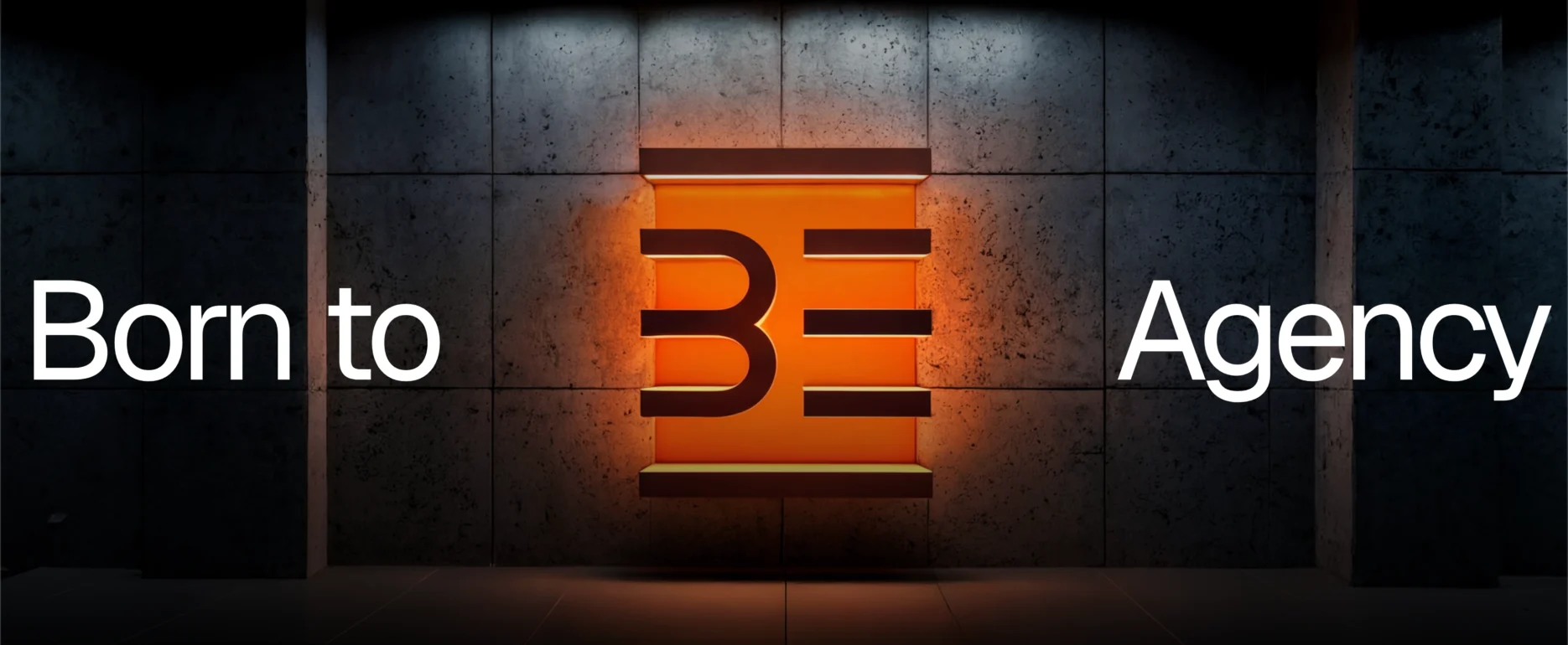
Be Agency
INDUSTRY/MARKETS
Trade Marketing
PROJECT PERIOD
July 2025 – ongoing
ACTIVATED SERVICES
Brand Identity · Digital Experience


[ 01. OVERVIEW ]
An identity built
on operational experience.
Be Agency has been operating in field marketing and retail for over 20 years, with an approach based on a real presence and daily action in the field. However, its visual identity no longer communicated this operational authority with the same force: it needed to evolve its positioning and make it more recognizable and contemporary, without changing what the agency is and does.
The strategic sessions revealed the key lever: enhancing the historic verticality in Food & Wine as a distinctive element to be brought into communication and design. This gave rise to two complementary needs: a brand identity capable of translating dynamism and operability into a modular visual system, and a digital experience designed to organize and make services, methods, and areas of intervention legible, while maintaining consistency and character.
[ 02. BRAND IDENTITY ]
A system built to move.
To represent an agency that operates in different contexts every day, we have built a modular identity inspired by grids and industrial retail environments. The double slash // becomes the heart of the system: not only a sign of movement, but a symbol of the connection between strategy and execution, visually uniting the different areas in which the agency operates.
Every stylistic choice responds to a functional, not decorative, need. The color palette is designed to ensure high contrast and maximum visibility in operating environments, while the typography has been selected for its extreme versatility, ensuring consistency across all media, from technical merchandising to institutional materials.
The result is a system that works, adapts, and always maintains the same recognizable character.
Be there. Be Agency
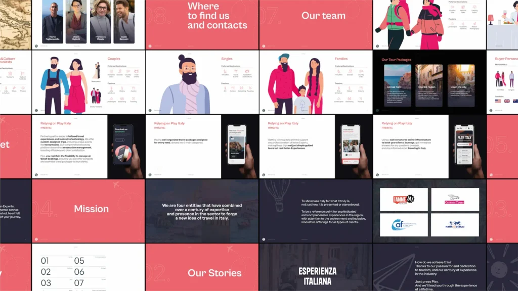
[ 03. DIGITAL EXPERIENCE ]
Organize complexity without losing it.
Be Agency operates in the fields of large-scale retail, Ho.Re.Ca, and creative development: different sectors that required rigorous synthesis in order to avoid fragmenting the message. We responded with an architecture that transforms complexity into clarity: each operational area has its own dedicated space, introduced by striking hero sections and explored in depth through interactive modules that highlight case studies. The user journey is fluid, designed to guide the eye from service to action with clear visual hierarchies.
But order does not mean rigidity. The site is conceived as a modular system, designed for speed of reaction: the structure allows for rapid updates and the addition of new projects without ever losing visual balance. The result combines rationality and expressiveness: a site that is not just a showcase, but an organized, clear operational tool ready to evolve alongside the agency.
Progetti correlati
Play Italy

Iamme Ia!
IT’S TIME TO
SHAKE UP YOUR BRAND.